Category: Uncategorized
Introduction
I’ve been leading teams for over 15 years. I have also been studying the works of several business thinkers. I liked some works better than others and most of the times, I learned new things. Sometimes I learned an entirely new concept (entirely new at least for me). Sometimes, I learned to look at something I already knew in a new light. The rest of the times, it felt like some of the thoughts were a mere regurgitation of some old idea. Regardless of the experience, it always felt valuable. So I started compiling notes. Then started categorizing these notes into topics, slowly building an information foundation. This body of knowledge is still in development. I am continuously adding new information as I come across new concepts and interpretations. I am also starting to add my own thinking derived from my own experiences.
Although this material is still evolving, it is a resource I consult regularly. I use it to challenge my intuition, to see if I can look at a situation from different view points. In sum, I use it to find answers to complex problems. And so far I feel it has worked. Recently and throughout my career, I’ve been fortunate to help create great working environments, where people enjoy coming to work and get to build wonderful things. This is why I want to share my thinking with you. So you can, if you want, look at things from a new perspective. A perspective that hopefully gives you new ideas on how to overcome your own challenges and achieve great things.
Some of the topics I will cover in this series include leadership, management, leading teams, resolving conflict, managing innovation and creativity, solving problems and making better decisions. I invite you to read through and to subscribe to make sure you don’t miss any post.
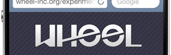
iPhone-optimized layout in 4 steps
This post will show you how to create a very simple landing page specifically optimized for iPhone. Through this example, we will go over two techniques to display retina-optimized images. One technique is used to load an alternative, higher resolution image for users with an iPhone with retina display. The other technique is to load an alternative, higher resolution background image for a div. You can use these examples to build a full layout for your mobile site.
Note that this post is not about responsive design, nor it uses grid systems. The primary intention is to explore techniques that will give maximum control when designing a layout for our website that is mobile-, and perhaps iPhone-specific.
Demo
Click to view a live demo of the code presented below. Remember, this template is optimized for iPhone.
1. Set the viewport
Setting the viewport makes the content scale properly within the available screen real estate. To learn more about the viewport meta tag, check out Apple’s article on configuring the viewport.
<meta name="viewport" content="width=device-width" />2. Using jQuery to load higher resolution images
Here we include the jQuery Retina Display Plugin. This plugin allows us to load images of higher resolution to be displayed in retina-ready screens. In this example, we will use the plugin to load an alternative version of the logo.
Remember to include jQuery itself before including the jQuery retina plugin.
<script charset="utf-8" type="text/javascript" src="http://code.jquery.com/jquery-latest.min.js"></script>
<script charset="utf-8" type="text/javascript" src="jquery.retina.js"></script>
The following Javascript allows us to selectively decide whether to load a higher resolution image or use a standard resolution one. You might want to do this when trying to keep bandwidth use low.
<script type="text/javascript">// <![CDATA[
$&;(document).ready(function() {
$&;('img.retina').retina();
});
// ]]></script>3. The Style
We will only go over a few things that are relevant to the creation of the mobile-friendly layout.
The page_wrapper element encompasses all the elements in our page. Here we set the height to the actual available height in an iPhone in portrait orientation mode. Look at the post mentioned in step one above to review screen pixel availability. We also load an image to overlay on our background (to give it some texture) and give it a relative position so we can later center our logo vertically. For details on this technique, see method 1 in this article.
#page_wrapper {
height: 356px;
background-image: url(stripe.png);
position: relative;
}
Here we use an inline media query to load an alternative image for our background. In this case, -webkit-min-device-pixel-ratio: 2 means that our device has a retina display. Then we load the alternative image and set the image size to half the size of the actual image. For some reason, not resizing the image to 50% (but in pixels, not in percentage) makes our image display in double its size. I recommend you experiment with the background-size value depending on the size of your image.
@media only screen and (-webkit-min-device-pixel-ratio: 2) {
#page_wrapper {
background: url(stripe-2x.png);
background-size: 10px;
}
}
Here we define the attributes of the div that will contain the logo. The position, top, left and margin attributes are part of the vertical centring technique mentioned in step #3 above.
#logo {
width: 225px;
position: absolute;
top: 50%;
left: 50%;
margin-left: -112px;
margin-top: -51px;
text-align: center;
}
4. The Body
Lastly, we look at the contents of the body of our document. The page_wrapper div contains the div that contains the logo and some text.
<div id="page_wrapper">
<div id="logo"><img class="retina" alt="logo" src="logo.png" width="225" /></div>
</div>
Mobile Site
All together now
“http://www.w3.org/TR/xhtml1/DTD/xhtml1-transitional.dtd”>
<meta http-equiv="Content-Type" content="text/html;charset=utf-8" />
<meta name="viewport" content="width=device-width, initial-scale=1, maximum-scale=1" />
<script type="text/javascript">// <![CDATA[
$&;(document).ready(function() {
$&;('img.retina').retina();
});
// ]]></script>
<style type="text/css"><!--
body {
margin: 0;
padding: 0;
font-family: helvetica, arial;
background-color: #334;
font-weight: bold;
color: #dedede;
text-shadow: 0 -1px #000;
}
#page_wrapper {
height: 356px;
background-image: url(stripe.png);
position: relative;
}
@media only screen and (-webkit-min-device-pixel-ratio: 2) {
#page_wrapper {
background: url(stripe-2x.png);
background-size: 10px;
}
}
#logo {
width: 225px;
position: absolute;
top: 50%;
left: 50%;
margin-left: -112px;
margin-top: -51px;
text-align: center;
}
--></style>
<div id="page_wrapper">
<div id="logo"><img class="retina" alt="logo" src="logo.png" width="225" />Mobile Site
</div>
</div>

iOS Usability Glitch
Today, a client asked us a very simple question: Why, when clicking on a link in an email sent by a web app, iPhone opens the mobile site through Safari instead of the app, which is installed on that very same iPhone? Good question. In fact, many of us have asked this question before. On your iPhone, try clicking on that new follower’s profile link that Twitter emails you when you get a new Twitter follower. The mobile site will open instead of the Twitter app you have installed. Or when you get a Facebook email: clicking on any link will open the Facebook mobile site through Safari, even though you have the Facebook mobile application installed.
This is a usability failure. There should be a way for developers or users themselves to instruct certain links to open in certain apps. For example, I wish all the Twitter links I click on my iPhone would open TweetBot, or that all the Facebook links I click on would open the Facebook native app. If these really big apps are not doing this already, it might just not be possible.
I went ahead and asked one of our iOS developers. He said he never tried to do this himself, but he saw that there was a way to bind an app to a custom URL scheme so when that URL is evoked, the app is launched. Great, but when we started going through the use cases, we realized that this might not be the best solutions. Here are some scenarios where this solution might not help:
Scenario 1: Clicking on a custom URL scheme on a non-iOS device. Obviously, this will not work. So you’d have to somehow make sure that these custom links are only sent to iOS devices.
Scenario 2: Clicking on a custom URL scheme on an iOS device that doesn’t have the application installed. We have not tried this, but saw somewhere in the comments on the posting referenced above that Safari will alert the user that it cannot open the link. This could be fixed by offering two links: If you have the app, click here. If not, click there. In our opinion, the usability cost doesn’t justify the benefit.
Scenario 3: Clicking on a custom URL scheme on an iOS device that has the app installed. This will work just fine. Except in the case where you use an independent Twitter client and Twitter decides to launch their own app from the links generated from their site.
In summary, there seems to be a good reason why this is still a bit of an annoying usability problem in iOS. It is one of those things that one thinks should be easy enough to accomplish until the implications are considered.
What is your take on this? Have you experience this before? Does it bother you? Or do you use a different platform other than iOS where this isn’t a problem?
Wheel Is Born
We are extremely excited to start our new firm and launch our web site. Wheel is a company with a clear objective: to help organizations communicate with their customers through great products and experiences.
Our services are focused on supporting marketing and communication teams in delivering a great customer experience.
Through engaging user experience design, dynamic web and mobile application development and picture-perfect marketing collateral, we bring value that otherwise would be cost-prohibitive for organizations with tight budgets.